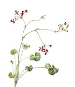
This is a long tutorial, many steps but since I know many of you have difficulty to understand the process, I thought it's better to share every little step I took in creating this drawing. Enjoy :)
Materials
Every twig with rose hips is different of course so only use this list of colours as a guide. Of course you can use my list but I strongly suggest you have a good look at your own rose hips to see what colours will be best for you.
This list is not complete. I used a lot of different other colours for smaller details. It is wise to get as much different colours so you have large range to pick from.
- Coloured Pencils:
Faber-Castell
234 Cold Grey VI
235 Cold Grey V
141 Delft Blue
278 Chrome Oxide Green
175 Dark Sepia
126 Permanent Carmine
223 Deep Red
121 Pale Geranium Lake
113 Light Orange
171 Light Green
168 Earth Green Yellowish
Prismacolor
1067 Cool Grey 90%
996 Grape
1095 Black Raspberry
925 Crimson Lake
923 Scarlet Lake
937 Tuscan Red
917 Sunburst Yellow
940 Sand
938 White
1026 Greyed Lavender
1087 Powder Blue
Yes, I use a lot of colours, I know :P
- Graphite pencils: HB, B, 2H, and the hardest you can get (I have 10H)
- Tracing paper
- Lyra Splender Blender (or another colourless pencil blender)
- Electric Eraser (like Sakura)
- kneadable eraser
- Embossing stylus, the thinnest you can get with a rounded tip. I use the Pergamano 0,5 10031.
- Low tack Frisket Film (you just need a small piece of that)
- Sketchbook/Sketching paper
- A sheet of HP watercolour paper. I use Fabriano 5. Any brand is good as long as it’s white and HP (which is very smooth). Don’t use Bristol because that will smudge too fast.
- A very good sharpener for your pencils.
- Fine sandpaper for sharpening the pencils.
- Eraser shield is optional
Step 1: Line Drawing

First of all you make a drawing of the twig in your sketchbook. Once you’re happy with it, make sure to erase all the sketch lines and mistakes, leaving a clean line drawing.
Now you trace this and transfer it on to your watercolour paper. Be very careful not to press your pencil too hard in the paper (this is very important!). Go over the graphite transfer lines with a very hard and pointed pencil (and don’t press too hard!!!). Draw very light, just enough to see the lines. Use your kneadable eraser to clean the paper, removing all the graphite powder from the tracing.
Step 2: White highlights

Before you start colouring anything you have to put the highlights in. I mean the very, very lightest parts. For now we'll call it white. The larger white reflections you can do with a white coloured pencil. I prefer to use my PC 938 because it is more "fat" than the Faber-Castell white. The tiny little spots of white or small light coloured light you want to save can be marked by using the embossing stylus. You press a little dimple in the paper so the next layers of colours won't reach that paper and stay white.
Step 3: Tonal Base

Now take the Faber-Castell greys and start putting in the shadows. Don’t press too hard. Make your shadows darker by taking a darker grey, not by pressing harder. Work gentle with small movements. Make small overlapping ellipses. Always use a sharp point, so often use your sharpener or sandpaper. Don’t push the greys too far into your drawing. Be sure to soften the edges to the white so you get a nice fade.
Step 4: Darkest shadow colours

Now start with the darkest colour for the shadows. Don’t pick a darker version of the base colour, don’t pick dark red. Pick something that glows through the red. I used Faber-Castell (FC) 141 Delft Blue and FC 278 Chrome Oxide Green. Again, add a very thin layer and don’t press too hard. Always a sharp point and gentle, gentle, gentle...
Step 5: First Colour

Take the colour you see all over the hips (the main colour). For me it was FC 126 Permanent Carmine. Put a soft layer of this red all over the hips where you can see that colour. Of course not on the white parts and not in the parts where it has a totally different colour.
As you can see I did the same with the twig, using FC 278 Chrome Oxide Green and FC 175 Dark Sepia in the shadows and FC 171 Light Green as the main colour.
Step 6: Deepen the colours

Have a look at the hips and look what colours you see “hidden” in the main red colour. I can see some orange glowing through the red in the lighter parts. Other parts have some blueish purple, I also see some browner reds. Put the right colour in those parts. In the image you can see I’ve added the FC 113 Light Orange. Still you’re not pressing the layers. Don’t forget to sharpen your pencils and work with small gentle movements. Don’t concentrate on details yet.
Step 7: Deepen the shadows

This is when I will make the shadows darker. I used a bit more FC 278 Chrome Oxide Green and Prismacolor (PC) 1095 Black Raspberry. I go really dark in the shadows and almost black where there are overlaps. Be sure you don’t go too dark near the edges.
Step 8: Deepen Reds

Take all your reds and layer your reds until you are happy with the colour. Try to use the FC pencils first and the PC last. When you feel good about it you can start using a bit more pressure to blend the colours together. Also put a layer of red over the shadows.
Step 9: Going Back To The Shadows

You might notice that the shadows got a bit weakened by the reds. So go back there and add again more colour. I used more PC 1095 Black Raspberry and in some parts a bit of FC 175 Dark Sepia and also PC 996 Grape.
The shadows in the rose hips closest to the viewer are darker. This is where I used more Black Raspberry. The hips further away have more Grape. This because it’s a cooler and a bit lighter colour. It’s a bit of aerial perspective.
Step 10: Blend the Reds

Now start blending all red layers with red coloured pencils. What I mean by that is that now you can start using more pressure to get a paint like effect and mix all the colours of the previous layers together. I love to use my Prismacolor pencils for this because the colours are just a bit deeper and stronger than the Faber-Castell pencils.
Be very careful not to go in the white parts. And even in this stage... keep your points sharp!
Step 11: The highlights

Now it is time to add the highlights. I used the PC 938 White. Be very careful to work from the white part to the red colour. Clean your pencil point every time it has been into the red and you want to go back into the white again. I also use the white with some pressure over the reds around the highlights as well.
Step 12: Reflected Light

After the highlights I take my PC Powder blue or a light cool grey or a greyed Lavender, what ever looks best, and add the reflected light in the shadows and around the shadow edge. Use a very sharp point and do this carefully. You want a sharp edge.
Now use the blender pencil all over the hips (but avoiding the white). If you feel the colours turned a bit dull you can lift it by adding a bit of red over it.
Step 13: Details


You can use the Frisket film or your electric eraser to lift colour from the parts where “nasty brown bits” are. Small damages, beasty bites and things like that. These not so perfect parts give a lot of charm to the hips and make them more alive.

Peel some of the paper off the film and lay it over the part where you need to lift the colour. DON’T stick the film on the drawing!!!!
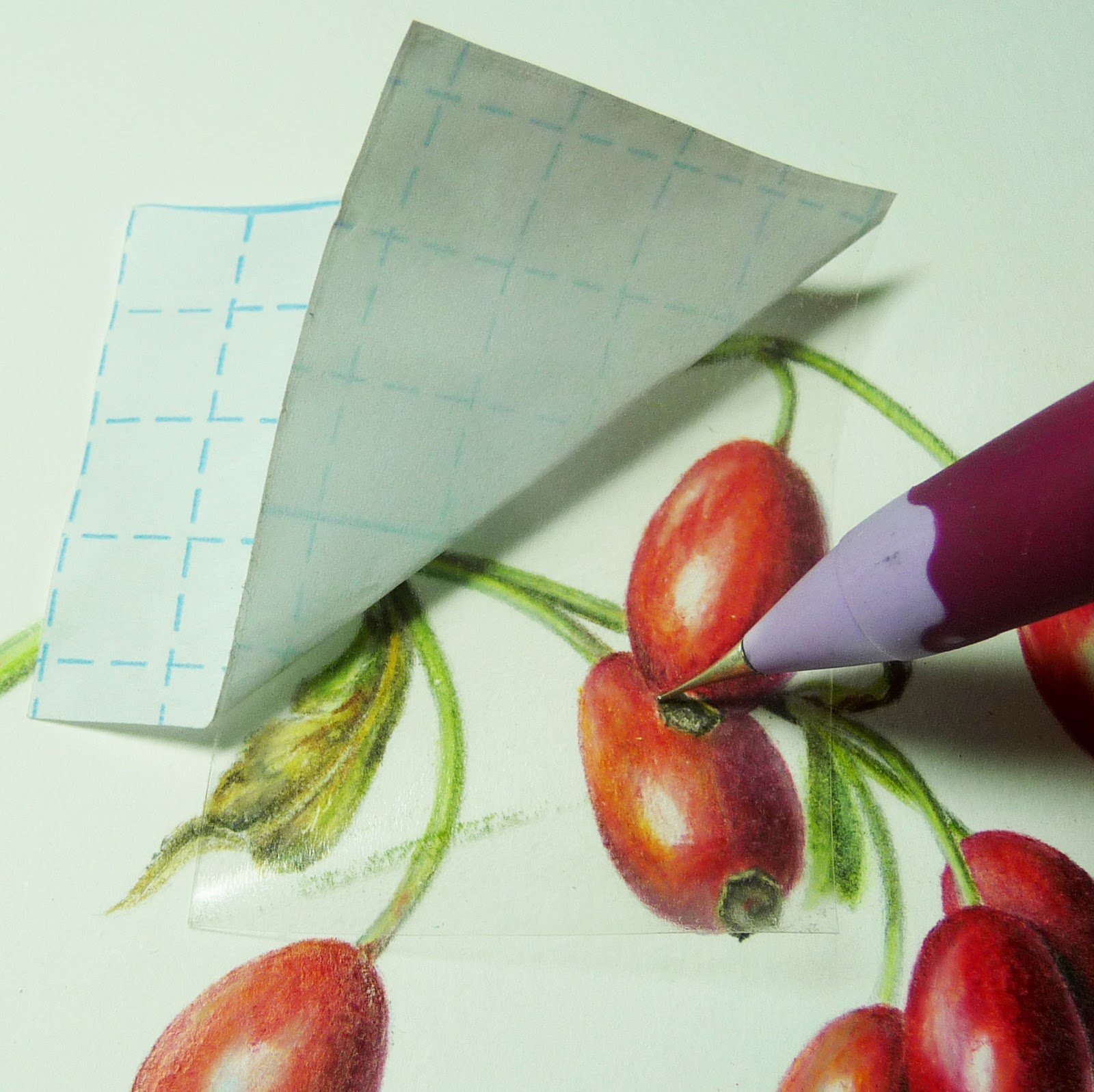
Take your stylus and make a tiny dot where the highlight should have been. You can also add a few new highlights like this if you feel it needs more white spots or lines.
Step 14: Sharpening the Lines
The drawing will look best if your lines are clean and sharp. On the other hand you don’t want it to be too sharp and crisp.
Most important is to have very, very sharp points on your pencils. It helps if you use a harder pencil than the Prismacolor pencils. Faber-Castell is hard but there is also the Prismacolor Verithin range. Very hard and very useful. The only problem is that you can only get it in the US.
Work from the “inside” of the drawing (see photo).

Finally you can use the hardest graphite pencil you can get (I have a 10H) and make a crisp line on the edge of your drawing. The reason why you need a hard pencil for this is that it gives a very thin line (use the sandpaper to make it dangerously sharp) but it hardly gives you a grey line.
Don’t overdo this crisp lining. Use it on tiny details, thin lines and very carefully along the stalks and stems. If you do too much or use a line that is too dark (too soft pencil) it will look artificial.


At the end, clean the paper with the kneadable eraser. Large boo-boos you can remove with the electric eraser (use an eraser shield if you need to do that near the drawing).

Finally
I hope you enjoyed this tutorial and that it all made sense, helped you and made you (more) enthusiastic about making botanical art with coloured pencils.
.


.jpeg)